I recently wrote about some of my favorite business card designs, so today I thought I'd branch that out show off some cool designs from a different print product.
The most common shared attribute among brochures is the fold, and that is something you can utilize to come up with some unique ways to present your information. I've found lots of really cool examples of how companies laid out the structure of their brochure in such a way that the fold adds to the experience. Of course, you can also do a lot with the tried and true rectangular brochure, especially if your type of business doesn't make as much sense to be bold and creative with the layout. Here are some good ones I've found from around the web:
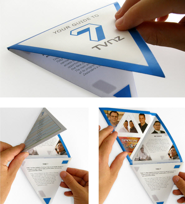
This one uses triangular folds so that it unfolds to form the number "7", which is part of the branding for this particular business.
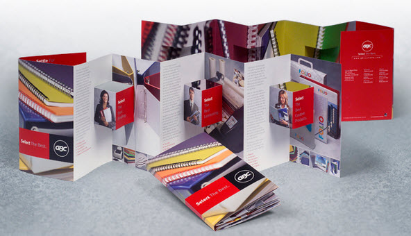
Everyone loves pop-ups! Brochures like this are eye-catching and fun for the reader.
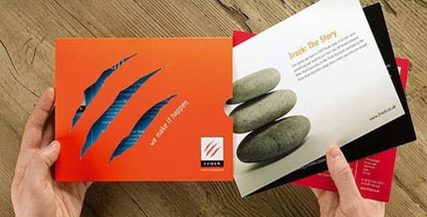
This brochures uses a cutout of the company logo to create a cool see-thru oppurtunity.
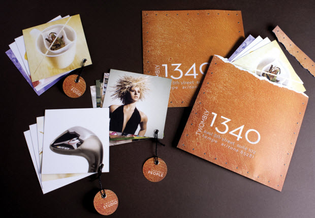
An array of techniques and print media were used to make this photography brochure a full on experience.
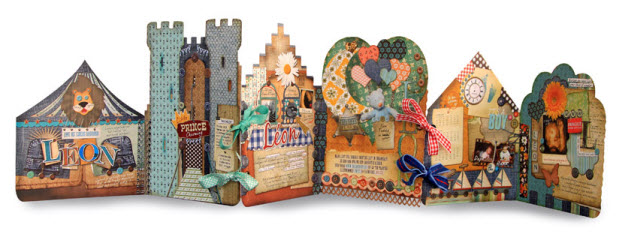
Talk about a fun design! Castles and the like are always an attention grabbing design choice.
That is all I have for today. If you are thinking of creating a brochure for you business or even just to market yourself, look around, there are lots of inspirational examples out there, good luck!

