
WordPress continues to be a dominant platform on the web, constantly fleshing out its feature-set to better adapt to the needs of its community. A big change in the way sites are designed these days has been driven by the ubiquity of mobile devices. Sites are now expected to work well no matter the size of the screen a user is browsing on. Everything needs a nice term or buzzword of course, so this design strategy has been coined "responsive".
Most WordPress themes that are new or under active development have updated their design techniques to make sure that your site will look great on mobile and desktop screens alike. Here are several that are well received by the community:
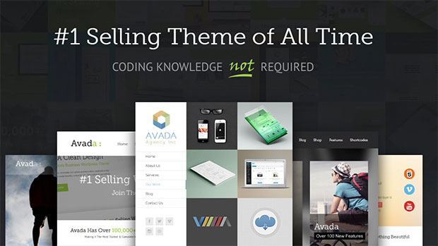
This theme boasts the impressive credential of the being the top selling theme on ThemeForest for over 2 years. The feature set ticks all the boxes, including a visual editor that will appeal to anyone that likes to get creative with their theme building without needing to touch a line of code.
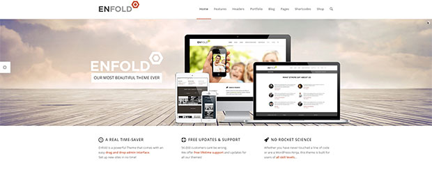
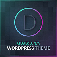
Another swiss army knife type of theme, the development hours that have gone into this are extremely high. It features a drag-and-drop admin interface, and claims to be the user-friendliest theme there is.
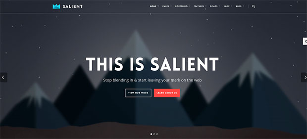
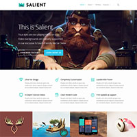
This theme features some very creative layouts that would be well suited to a portfolio site. Comes with a visual page builder and a YouTube video series to help you get going.
These are all very high quality and well supported themes that can be modified and extended as little or as much as you like. If you have a site redesign or a new idea in mind, definitely give these themes a serious look. If you are new to this, be sure to look around to find the best shared hosting plan you can. Websites can be launched for dirt cheap these days, most host providers will provide a great place to put your site for around $5 per month. If you use any of these themes or have some others you'd like to suggest, let me know!


Leave Your Response